Basic Image Handling in Remix
This is the simplest approach to optimized image loading in Remix. In fact, it barely even uses anything from Remix. It's just good ol' HTML img component using srcset and sizes attributes, along with a blurred placeholder image set using the CSS background property. The only Remix-y thing we do is exporting a links function to preload the placeholder image.
Here's is the result:

And here's what the full code would look like:
import placeholderImgSrc from "./sleepy_girl_placeholder.webp";
import fallbackImgSrc from "./sleepy_girl.webp";
import smallImgSrc from "./sleepy_girl_small.webp";
import mediumImgSrc from "./sleepy_girl_medium.webp";
import largeImgSrc from "./sleepy_girl_large.webp";
export function links() {
return [
{
rel: "preload",
href: placeholderImgSrc,
as: "image",
},
];
}
export default function Image() {
return (
<div
className="max-w-[800px] aspect-[3/4]"
style={{
background: `top / contain no-repeat url(${placeholderImgSrc})`,
}}
>
<img
className="w-full"
alt="A puppy sleeping on it's back with it's mouth slightly open"
src={fallbackImgSrc}
sizes="(min-width: 400px) 800px, 100vw"
srcSet={`${smallImgSrc} 400w, ${mediumImgSrc} 640w, ${largeImgSrc} 800w`}
/>
</div>
);
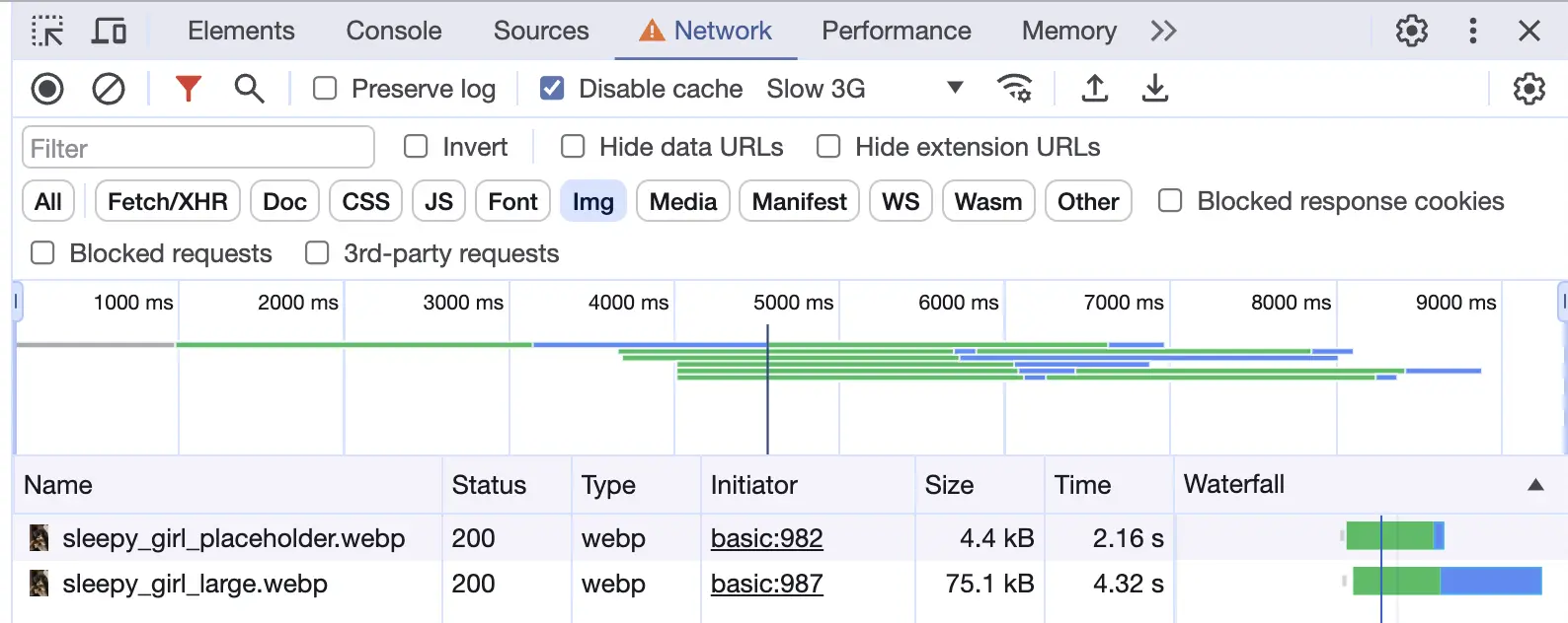
}And here is the a video of the image loading:
Image Files
When delivering images on the web, it's important to provide different sizes and formats to ensure the best performance across various devices and network conditions. In this example, we use the WebP format for the images, which provides better compression and quality than JPEG and PNG.
You also need multiple images of different sizes to serve the most suitable image based on the viewport size and device pixel ratio.
Providing on-demand optimized images of various formats and sizes is what an Image CDN does for you. Since this is just a basic example, we're providing these images manually. This is what we've got:
sleepy_girl.jpg: The original image in JPEG format.sleepy_girl_placeholder.webp: A small, blurred version of the image that serves as a placeholder while the actual image loads.sleepy_girl.webp: The fallback image that will be loaded if the browser doesn't supportsrcset.sleepy_girl_small.webp,sleepy_girl_medium.webp,sleepy_girl_large.webp: Different sizes of the image to be loaded based on the viewport size and device pixel ratio.
Generating the Images
We use ffmpeg to generate these images from an original photo. The command below scales the image to a specific width (in pixels) and sets the image quality (-q:v) to 80 (out of 100) to reduce the file size:
$ ffmpeg -i ./sleepy_girl.jpg -vf scale=200:-1 -q:v 80 ./sleepy_girl.webpThe placeholder image is created by scaling down the original image and applying a box blur effect:
$ ffmpeg -i ./sleepy_girl.jpg -vf "scale=iw/10:-1,boxblur=5:1" ./sleepy_girl_placeholder.webpThe resulting file structure looks like this:
├── sleepy_girl.jpg
├── sleepy_girl.webp
├── sleepy_girl_small.webp
├── sleepy_girl_medium.webp
├── sleepy_girl_large.webp
└── sleepy_girl_placeholder.webp
The Placeholder
We render the placeholder image using the CSS background property. This approach provides a smooth user experience as the placeholder is instantly replaced by the actual image once it's loaded. To avoid cumulative layout shift (CLS), it's crucial to provide the proper width and an aspect ratio:
<div
  className="max-w-[800px] aspect-[3/4]"
  style={{
    background: `top / contain no-repeat url(${placeholderImgSrc})`,
  }}
>
  <img />
</div>
Preloading the Placeholder
To ensure the placeholder image loads as quickly as possible, we preload it using the links export for the route:
export function links() {
  return [
    {
      rel: "preload",
      href: placeholderImgSrc,
      as: "image",
    },
  ];
}
This guaruntees that this image will start loading first
The srcset and sizes Attributes
The srcset attribute allows the browser to choose the most suitable image source based on the viewport size and device pixel ratio. The sizes attribute informs the browser about the displayed size of the image. While it's possible to manually set these values, it's recommended to have them programmatically created for a more efficient loading strategy:
<img
  className="w-full"
  alt="A puppy sleeping on it's back with it's mouth slightly open"
  src={fallbackImgSrc}
  sizes="(min-width: 400px) 800px, 100vw"
  srcSet={`${smallImgSrc} 400w, ${mediumImgSrc} 640w, ${largeImgSrc} 800w`}
/>
This is what causes the browser to load the most suitable image based on the viewport size and device pixel ratio, as seen in the demo video above.
Conclusion
This guide provides a basic understanding of how to handle images in Remix using srcset and sizes attributes, along with a blurred placeholder image. For a deeper understanding of these concepts, consider exploring the MDN Web Docs for the img attribute.